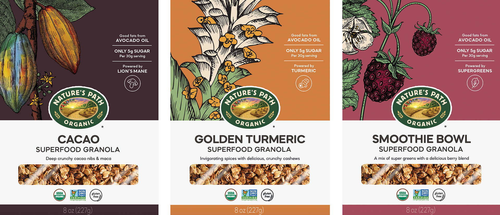
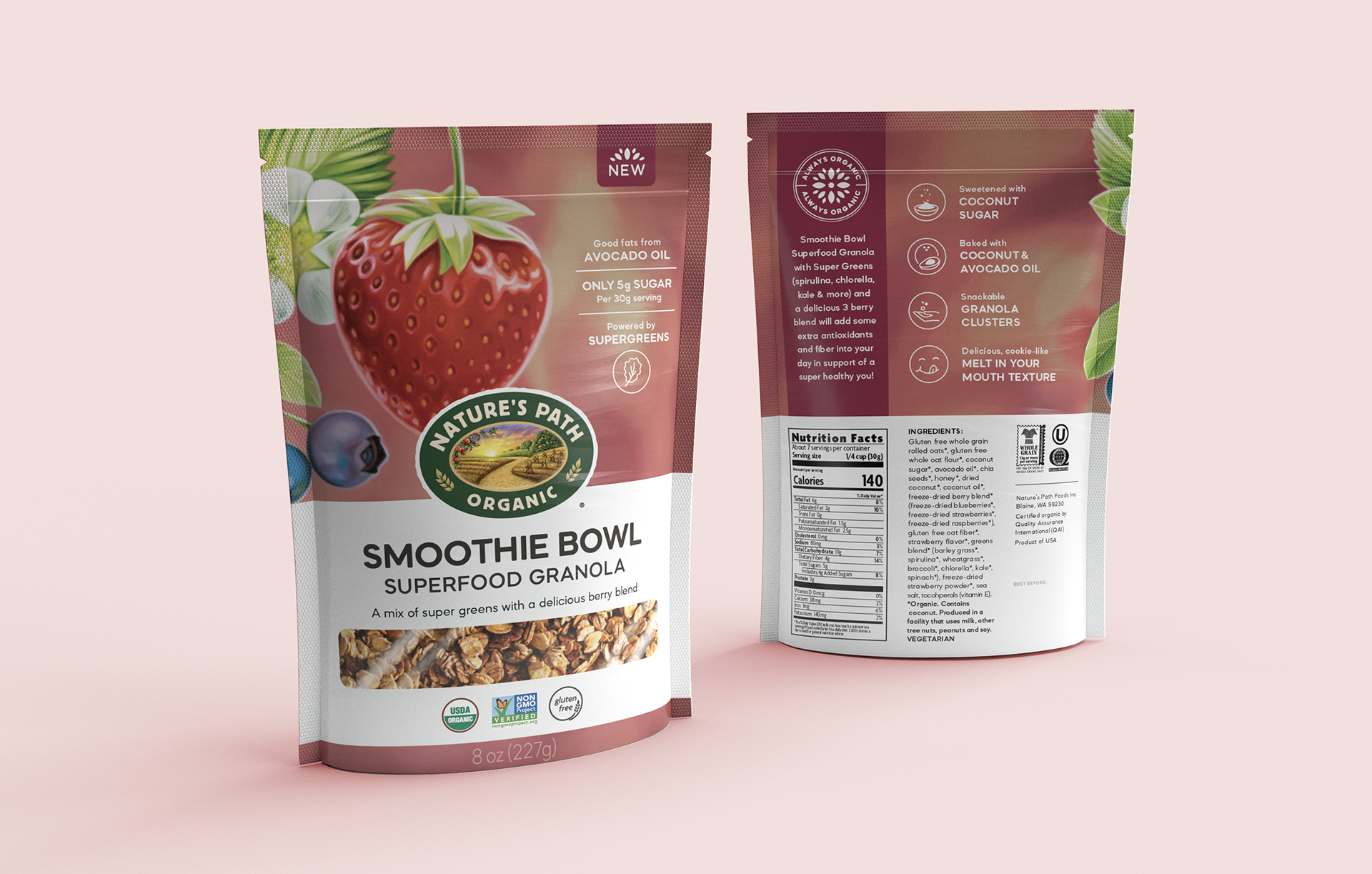
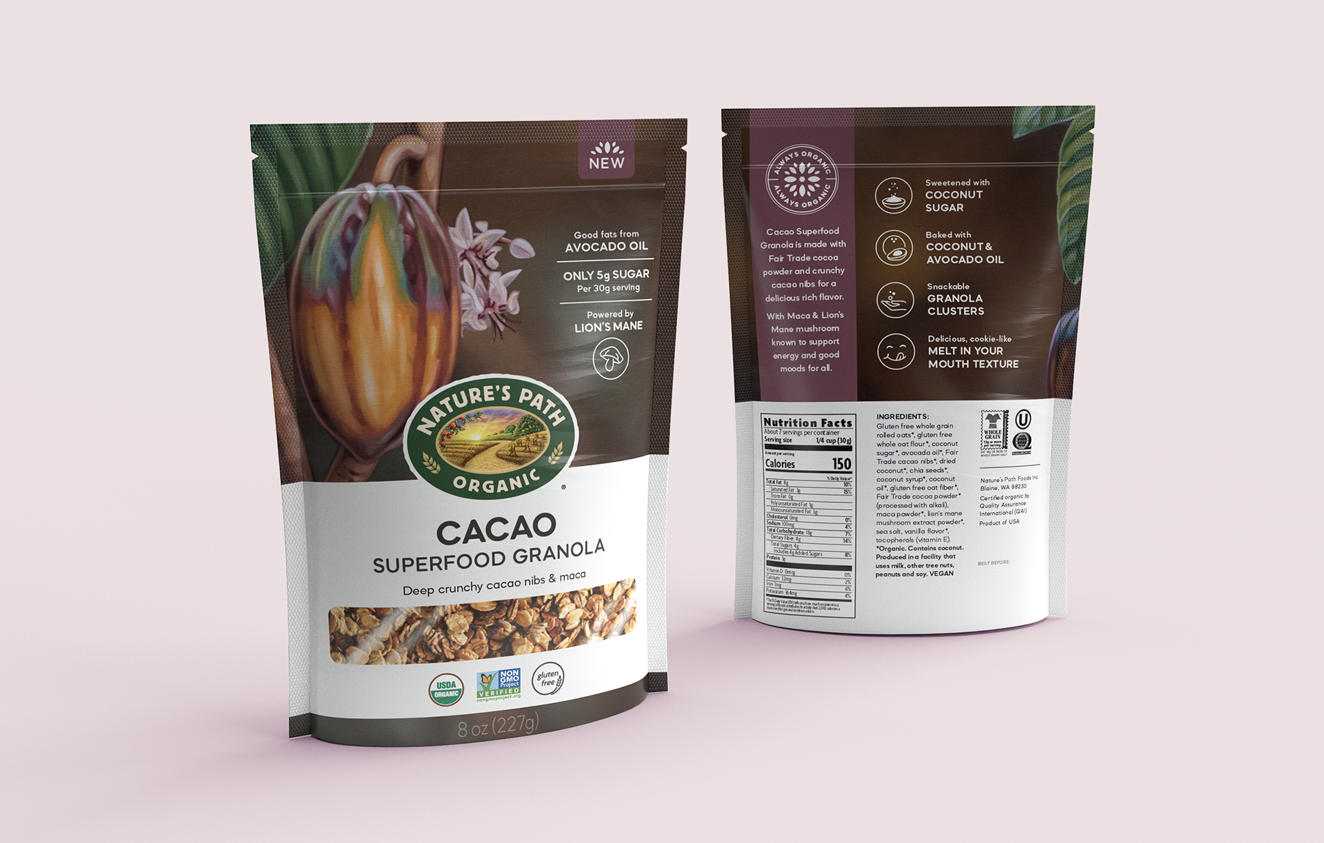
Ask: Nature’s Path is a global food company in the breakfast category. Family-owned and operated for 50+ years, their packaging felt outdated, and the team wanted to refresh their granola pouches while highlighting taste and functional ingredients.
Answer: We chose to communicate taste and function through aspirational artwork vs. literal product photography. The colour palette is bold and the design is stripped down, to help appeal to a younger target and cut through the clutter. To maintain shelf blocking with older packs we kept the core design elements in place (logo, paper band, etc.)


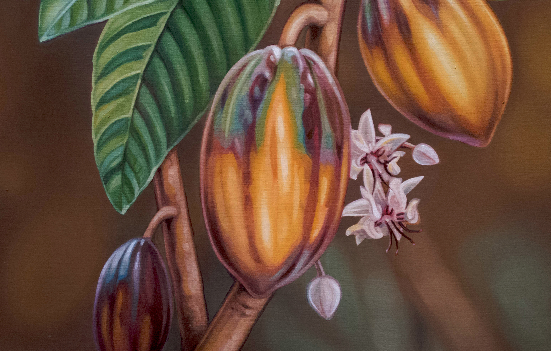
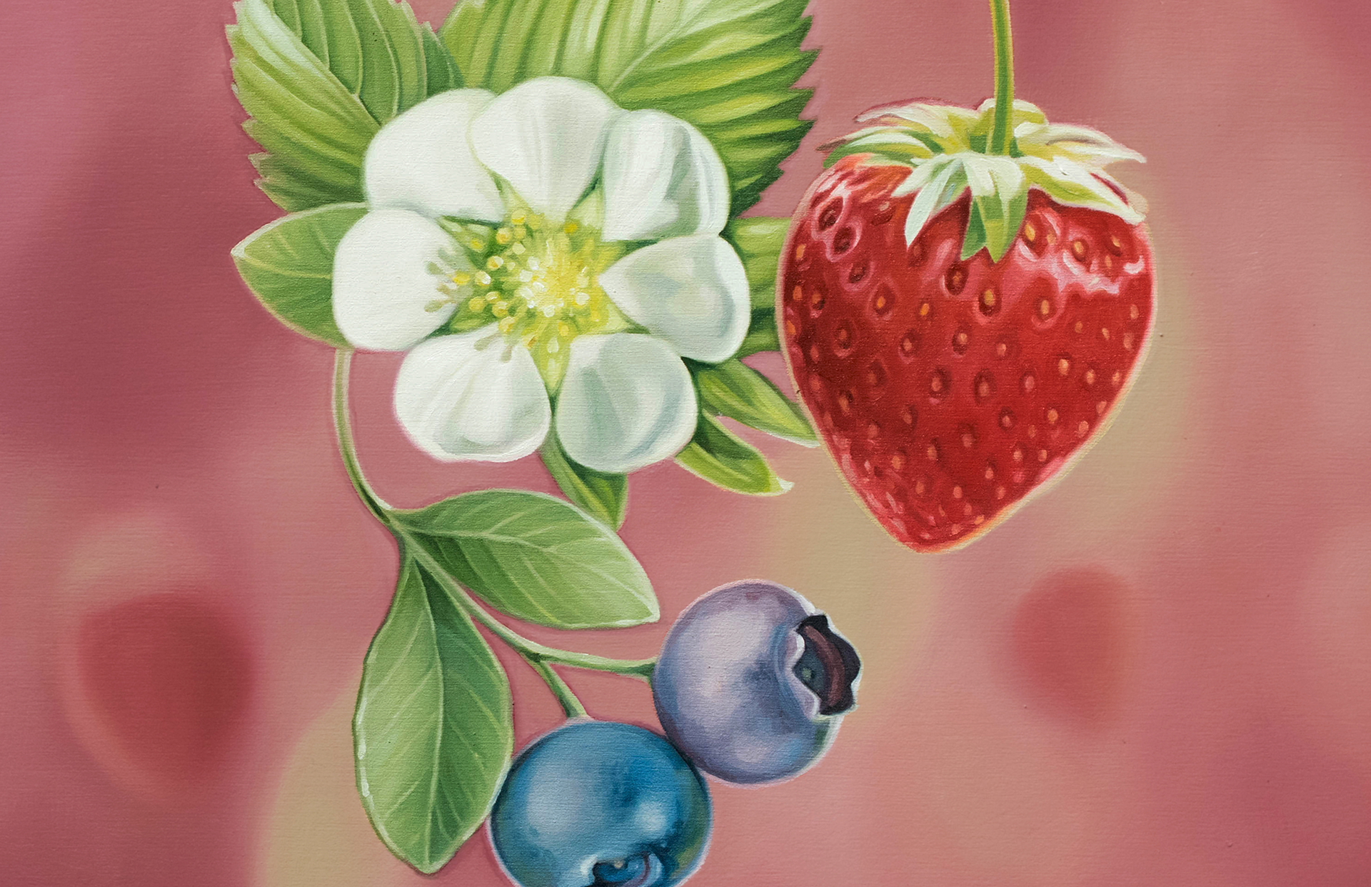
Concept sketches I developed for the artist to interpret in his own unique style.